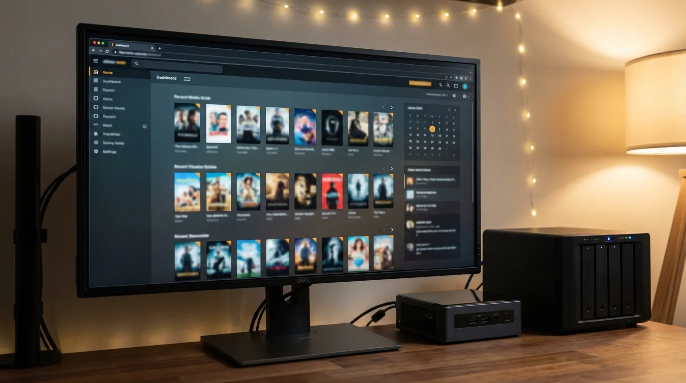
Use Jellyfin Themes to Customize Your Interface Like a Pro
Jellyfin feels honest. It gives you control, it stays out of your way, and it does not try to upsell you every time you press play. Then you open the web UI and think, “Okay, functional. But I want it to feel like mine.” If you care about aesthetics, the default look can feel like a rented apartment. Totally fine, but you want to paint the walls.
This guide walks you through installing themes, making safe visual tweaks, and building your own theme from scratch. You do not need to be a designer, but you do need patience. Theme work is half taste and half troubleshooting.
What a Jellyfin theme changes and what it does not
When people say “theme,” they usually mean “the web client look.” In practice, Jellyfin themes tend to fall into a few buckets.
Web client styling
This is the main one. It changes colors, fonts, spacing, hover states, button styles, and layout details in the browser. Most community themes are CSS that overrides Jellyfin’s default styles.
Branding elements
You can swap backgrounds, adjust the login screen, and change the vibe of the UI. You cannot magically redesign every screen without putting in work, because Jellyfin’s UI has its own structure and class names.
Client limitations on TVs and apps
This part frustrates people. Many TV and mobile clients do not load your custom web CSS. Your theme may look perfect in Chrome but barely show up on Android TV. That is not you failing. That is the reality of separate client apps.
If your goal is a consistent “cinema” feel across devices, you can pair a theme with preroll videos. A preroll plays before your movie or episode and sets the mood in a way a CSS tweak cannot. If you want to go down that path, Jellyfin preroll videos for cinema mode are a fun companion to interface styling.
Before you start, set your theme goals
I have seen people spend hours tweaking CSS and end up with a UI that looks like a hacker terminal and a wedding invitation had an argument. It happens. Decide what you want before you touch anything.
Pick one direction.
Comfort theme for long browsing sessions. Softer contrast, bigger text, calmer highlights.
Home theater theme for TV use. Higher contrast, larger posters, fewer tiny controls.
Brand theme that mimics a streaming service vibe. Clean, punchy accent color, crisp typography.
Also decide what you will not change. Restraint saves you. If you only adjust accent color, fonts, and poster corners, you can get a personal look without breaking layouts.
How Jellyfin loads custom CSS
Jellyfin’s web client lets you inject CSS. That is the safest way to theme because it does not require editing core files. It also means updates are less painful.
Where to add CSS
In the Jellyfin dashboard, look for the section that allows custom CSS for the web interface. Paste your CSS there and save. Then refresh the web client.
If you do not see changes, do not panic. Caching is the number one theme killer.
How to force the browser to show your changes
Hard refresh your browser page.
Clear site data for your Jellyfin domain.
Try a private window to bypass cached styles.
I keep a private window open for theme work. It feels wasteful until you realize it saves you from chasing ghosts.
Installing a community theme without breaking your setup
Community themes range from polished to “I made this at 2am and it works on my laptop.” Both have value. You just need a safe process.
Step-by-step theme install workflow
Copy the theme CSS into a plain text file. Keep it on your desktop so you can revert fast.
Paste it into Jellyfin’s custom CSS field. Save.
Test key screens. Home, library view, item details, playback controls, user menu.
Test with different content types. Movies, series, music, photos if you use them.
Test on a second device. A phone browser helps you spot spacing problems.
What to look for when a theme goes wrong
Text becomes unreadable because contrast drops too far.
Buttons lose hover or focus states, so keyboard navigation feels broken.
Posters stretch or crop in weird ways.
Headers overlap content on smaller screens.
If you see these issues, do not throw the theme away. You can often fix it with a small override at the bottom of your CSS. Theme CSS is not sacred. It is a starting point.
My opinion on themes, subtle beats flashy
Flashy themes look fun in screenshots. Living with them is another story. Neon accents and ultra-thin fonts feel slick for ten minutes, then your eyes get tired. I keep coming back to themes that feel calm and readable. A media server is something you use at night, on a couch, from across the room. Comfort matters.
If you want a “theater” feel, I would rather add that vibe with prerolls than with aggressive UI colors. A clean interface plus a short intro video hits harder than a UI that screams at you.
If you want to build a cinema flow, pair your theme with prerolls and keep your UI restrained. You can browse the preroll library and pick intros that match your style without forcing the entire interface into a costume.
Creating your own Jellyfin theme from scratch
Making your own theme sounds intimidating, but you can do it with a tiny set of changes. Start small, then grow it when you feel confident.
Tools you need
A desktop browser with developer tools.
A text editor.
Time to test and adjust.
A safe way to structure your theme CSS
Write your CSS in sections. You will thank yourself later.
Base colors and backgrounds
Typography
Buttons and focus states
Cards and posters
Dialogs and menus
Start with variables you control
Even if Jellyfin’s internal CSS changes, your own variables keep your theme consistent. Here is a pattern that helps.
| Theme element | What you are controlling | Why it matters |
|---|---|---|
| Accent color | Links, active tabs, progress bars | Sets the mood without breaking layout |
| Background layers | Page background and card surfaces | Helps posters stand out and keeps text readable |
| Font sizing | Titles, metadata, menus | Makes browsing feel relaxed on TV and tablets |
Once you pick your palette, stick to it. A theme falls apart when you use five near-black backgrounds and three different grays for text. Your brain notices, even if you cannot explain why it feels off.
Practical CSS tweaks that make Jellyfin feel personal
These are the changes that pay off fast. You do not need to rewrite the UI. You need a few sharp decisions.
Make posters feel intentional
Poster corners, shadows, and spacing change the entire vibe. Rounded corners can feel friendly. Square corners can feel strict. Pick one and commit.
Try a gentle poster shadow and consistent corner radius. Keep it subtle so it does not look like stickers floating above the page.
Fix readability before style
If you do one thing, increase readability. Better text contrast makes Jellyfin feel higher quality, even if you do nothing else.
Raise body text contrast against your background.
Increase line height in descriptions.
Keep metadata smaller than titles, but not tiny.
Respect focus states
This is where a lot of themes mess up. They remove outlines because they look “ugly,” then keyboard navigation becomes guesswork. If you change focus styling, replace it with something visible. A subtle glow in your accent color works.
Make the home screen calmer
The home screen can feel busy if every row screams at you. Reduce visual noise.
Lower the intensity of hover effects.
Use one accent color, not a rainbow.
Reduce harsh borders.
I like a home screen that feels like a shelf, not a dashboard.
Brand matching without copying a streaming service
People love to mimic major streaming UIs. I get it. Those interfaces feel familiar. Still, a direct copy can feel awkward, like a costume party where one person shows up in a screen-accurate outfit and everyone else wore jeans.
A better approach is to borrow the mood.
Pick a single accent color and use it consistently.
Use a clean font stack and avoid ultra-thin weights.
Keep spacing generous, so posters can breathe.
If your goal is the full “channel” experience, prerolls do the heavy lifting. A short intro can turn your library into a branded station without forcing the UI into a clone. If you want to set up the playback side of that, this Jellyfin cinema mode preroll setup guide pairs well with theme work.
Theme testing checklist that saves your sanity
Theme changes feel small until you break something and your family starts texting you screenshots. Test like you mean it.
Pages to test
Login screen and user switcher
Home screen rows
Library grid and list views
Item details page including cast and similar items
Playback controls and subtitles menu
Dashboard pages if you administer your server in the browser
Accessibility checks you should not skip
Can you read text from a couch distance on a laptop or TV browser?
Do buttons look like buttons?
Can you see focus when you tab through controls?
Does your accent color work for error states and warnings?
Theme work can feel like pure taste, but readability is not taste. It is comfort.
Common theme problems and how to fix them
You will hit at least one of these. That is normal.
Your CSS changes do not show up
Clear cache for your Jellyfin site.
Try a private window.
Check for syntax errors like missing braces.
A theme breaks after a Jellyfin update
UI updates can rename classes or shift layout structure. If your theme targets deep nested selectors, it will break sooner.
Fix approach that works:
Identify what broke. Do not rewrite everything.
Use dev tools to find the new class names.
Prefer simpler selectors where you can.
Text looks washed out or too bright
Dark themes fail in two ways. Some go too gray and feel foggy. Others go too bright and feel harsh. Adjust your background and text colors together. One slider at a time. If you change five things, you will not know what fixed it.
Mobile layout feels cramped
Your theme may look fine on desktop and cramped on mobile. Use media queries to adjust padding and font sizes for smaller screens. Keep your mobile changes minimal. You want consistency, not a second theme.
Theme design tips that make your UI feel finished
This is the part nobody wants to hear. Most “unfinished” themes fail because of tiny details, not because the accent color is wrong.
Pick one corner radius
If posters are rounded but buttons are square and dialogs are rounded again, your UI feels stitched together. Choose one radius and apply it across cards, inputs, and buttons.
Use shadows sparingly
Heavy shadows can look cheap fast. A soft shadow works when it helps separation, like card surfaces on a slightly lighter background. If your shadow is noticeable, it is too much.
Keep hover effects calm
Hover effects should guide you, not perform. A slight lift or border change is enough. If posters zoom hard, the whole grid starts wobbling, and it feels messy.
Pairing themes with prerolls for a unified vibe
Interface theming changes how browsing feels. Prerolls change how playback feels. Together they can make your server feel like a curated channel.
Here is what I like:
A restrained dark theme with a single accent color.
A preroll that matches that accent color or mood.
Consistent artwork style in your libraries, like matching poster sets where you can.
If you want to create your own intro video to match your theme, you can start from templates and build something personal with the create your own preroll workflow. I like this approach because it gives you style without risking UI breakage.
A simple plan you can follow this week
If you want results without living in CSS for days, do this.
Day one Pick an accent color and a background direction. Dark and calm works for most setups.
Day two Adjust readability. Text contrast, font size, line height.
Day three Tweak posters. Corner radius, shadow, spacing.
Day four Test on a second device and fix the two most annoying issues.
Day five Add a preroll that matches your vibe and call it done.
You can keep tinkering forever, and I get the temptation. Still, the goal is a UI you enjoy using, not a UI you keep rewriting.
When you should stop theming and leave it alone
There is a point where theme work turns into a side hobby. That can be fun. It can also be a trap.
Stop when:
You have readable text and clear controls.
Your home screen feels calm.
Your theme survives your normal browsing without visual glitches.
If you want more personality after that, add it through artwork and prerolls. Those changes carry mood without messing with layout rules. Interface themes should feel like a well-fitted jacket, not a suit of armor.


